If I plot the number of downloads per episode over the length of an anime series, are there interesting trends? I’m using the data and estimation methods from Over 9000 and graphing the number of downloads for each episode 7 days from when the torrent is available.
I’m also showing a shaded region to indicate potential error in the estimate: When we extrapolate from only a little data then it’s less reliable.
Winter 2015
I picked out some of the top shows of the season to investigate.


The data is quite messy, partly because I was working out the kinks during the Winter and couldn’t re-scrape any old data with updated code. There’s a drop in the middle of the season for several shows that seems to be a bad bug (since fixed). Aldnoah.Zero has a couple weird data points for episodes 1, 4, and 7 even though the show started at episode 13 in the Winter. Similarly, this was the second season of Log Horizon and there was a tiny amount of data for episode 11 which was season 1.
Even ignoring some of those blips the data isn’t very consistent. I’d expected them all to have a downward trend – losing some percent of viewers every week. But only some shows look that way.
Spring 2015 (ongoing)

DanMachi is an interesting case because there’s very little drop-off in viewers as the show progresses. Some ups and downs that may just be noisy data.
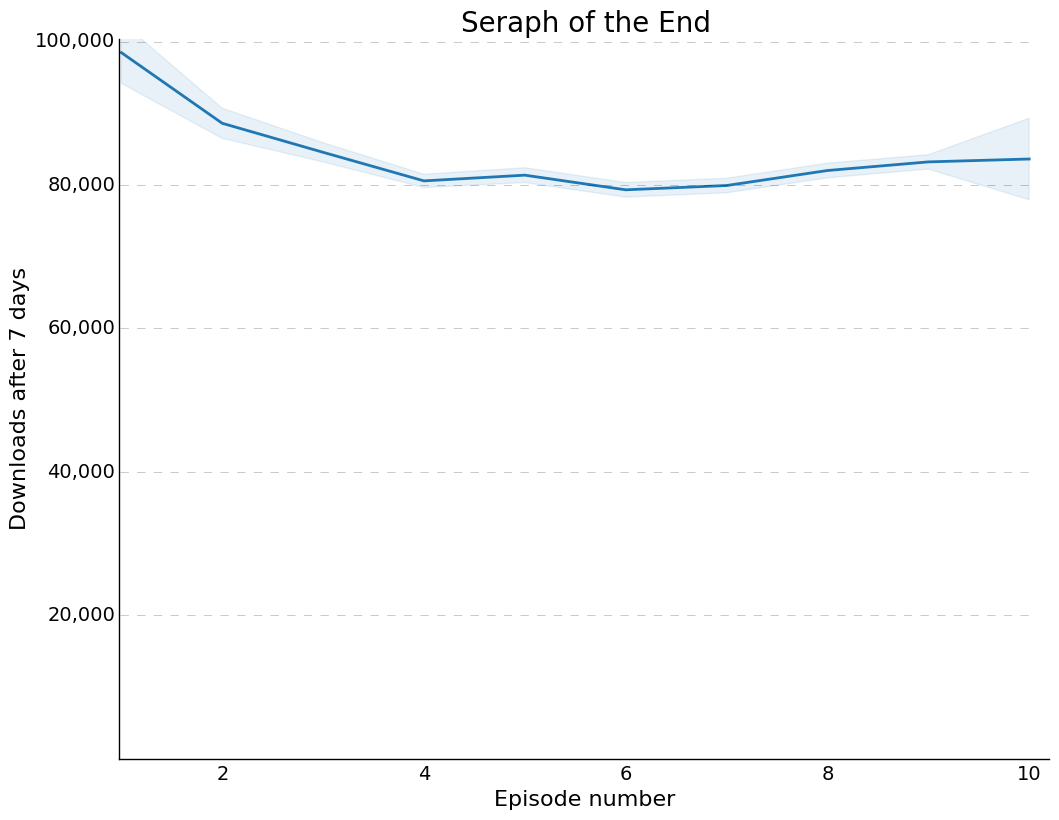
Seraph of the End has a very smooth curve – it seems consistent with my guess that people try out shows for a couple episodes before deciding to watch the whole season.


First off, my code didn’t merge all of the torrents for Fate/Stay UBW correctly so there are two groups here. The difference is that one of them was linked up to a page for 2nd season and the other was linked to the first season page. Both seasons are 12 episodes and you can see that the first graph has the bulk of the data starting at 11-12. This happened because I had just started scraping in January so I only barely caught the end of Fall 2014 season.
Regardless, the interesting thing is that there’s no drop-off between episode 1 of second season and episode 2 (in the top graph that’s ep 13 and 14). This may be a fundamental difference in a show that’s split into two quick seasons.
The other interesting trend is that it’s getting more downloads in 7 days as the season goes on.

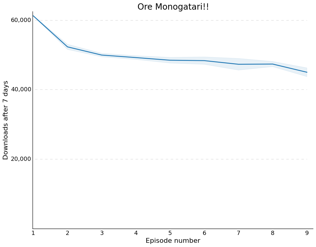
This show looks “normal”: early drop off then leveling.

There’s very little ep 1-2 dropoff here and a strange blip at episode 7.

Another strange trend but overall downward. The data looks correct for episode 1 but I don’t know why it’d be so much lower.

Normal downward trend.


Arslan Senki ended up with two entries even though it’s the same show. That happened because google search linked one to the 2015 version and the other to the 90’s series. The show tends to lose viewers each week with less of a plateau than other shows.
Another drop-off between episodes 1 and 2 then slow decline.
Rough trends
Shows roughly lose downloads/viewers from one episode to the next. More people stop watching early on, probably they’re just checking it out to see if they’ll like it or not.
But the data is quite noisy, especially any older data. And certain shows buck the trend – DanMachi for instance retained almost all its viewers and Unlimited Blade Works gained viewers over time.
Can we predict ratings?
It’s great when people rate shows on sites like MyAnimeList but it’s a small percentage of the viewers and many wait to rate until the show is over. It’d be great if we could use the shape of the curves to indicate how good a show is.
I looked at the data from 6 shows in Winter and 7 shows in Spring as a proof of concept experiment. I manually picked the first episode of the season and the last episode with reliable data. Then I computed the percent of viewers that stayed all the way through.
Separately I found the ratings for each show on MyAnimeList and correlated with viewer retention. The Google Sheet is available here.

There’s some correlation there but the Pearson correlation value is only 0.59. Viewer retention clearly isn’t everything.
What about correlation with the total number of downloads for the last episode? That’s only slightly better at 0.63. Correlation with the downloads of the first episode is 0.61 (that’s better than retention).
Looking into Winter and Spring separately
What if we analyse completed shows and ongoing shows separately? I didn’t expect it but they exhibit drastically different trends.
Winter
The most correlated value with ratings is retention, with a coef of -0.08. That’s so low that there’s really no correlation at all.
Spring
The most correlated value is retention (percent viewers from first ep still watching at last). This has a correlation coefficient of 0.80!
What does it mean?
Viewer retention isn’t predictive of a show’s eventual rating. But it’s very predictive of the show’s rating while it’s still airing. I suspect people that stop watching give low scores while the show is airing but when it’s finished a much larger group of people give true ratings.
So we haven’t learned how to assess show quality by torrent downloads but we’ve learned something about what the ratings mean for still-airing shows.
Notes/Caveats
1. I would’ve preferred to use Spearman correlation over Pearson because I didn’t expect a linear relationship between retention and ratings. But I didn’t see an easy way in Google Sheets.
2. I half expected the graphs to be pure noise but some of them are noise-free. It seems that noise-free graphs may be achievable. But there may be trends I don’t understand yet, such as the impact of v2 releases or delays.

One thing to also note is that you’re only looking at the 7 day statistic. As the season passes there’s also growth in viewership of the past episodes.
Yeah there’s people who stop watching. But there are also people who join mid season, catch up, and then start watching.
So when the 7 day stat stays constant it isn’t really because they retained all the viewers.
Also interesting to note that the numbers are quite similar. It’d be interesting to do trend analysis with Reddit popularity surveys. Discrepancies could be due to people using legal streaming, or just torrenting for that particular show. It could also be due to different demographics.
Interesting to note Crunchyroll had 400k subscribers half a year ago. And torrenters do have a different demographic, a lot of people would use third party streaming sites.
it is a very useful demographic though.
I thought I’d linked this somewhere but maybe not: Here’s correlation of Spring 2015 shows with the Reddit survey. https://docs.google.com/spreadsheets/d/1duzh35QIqK97cDthPtPamjEIFZSD4tETJwiGSjbXJLo/edit?usp=sharing Some of the popular shows got split into two entries but if added up it’s 0.87 Pearson correlation coef (pretty high but not perfect). Spearman would be more appropriate but I couldn’t see an easy way to do that in Google Sheets. In any case, since then I improved the grouping of different names so it shouldn’t split a show up as often.
You’re right that I don’t know for sure what happened between episodes. The data just doesn’t have any info like user IDs or such.
It could be that people picking up shows later on is what leads to the different shape of some curves – the really flat ones must not be getting late viewers and the others may spread by word of mouth and such.
My original plan was to fit a single equation to the data and use the equation parameters to describe the short and long-term popularity of the show. That’d avoid the danger of picking 7 days as a reference point. But curve fitting isn’t really accurate enough for that yet.
If you’d like to play around with the data yourself I can do a Json dump.